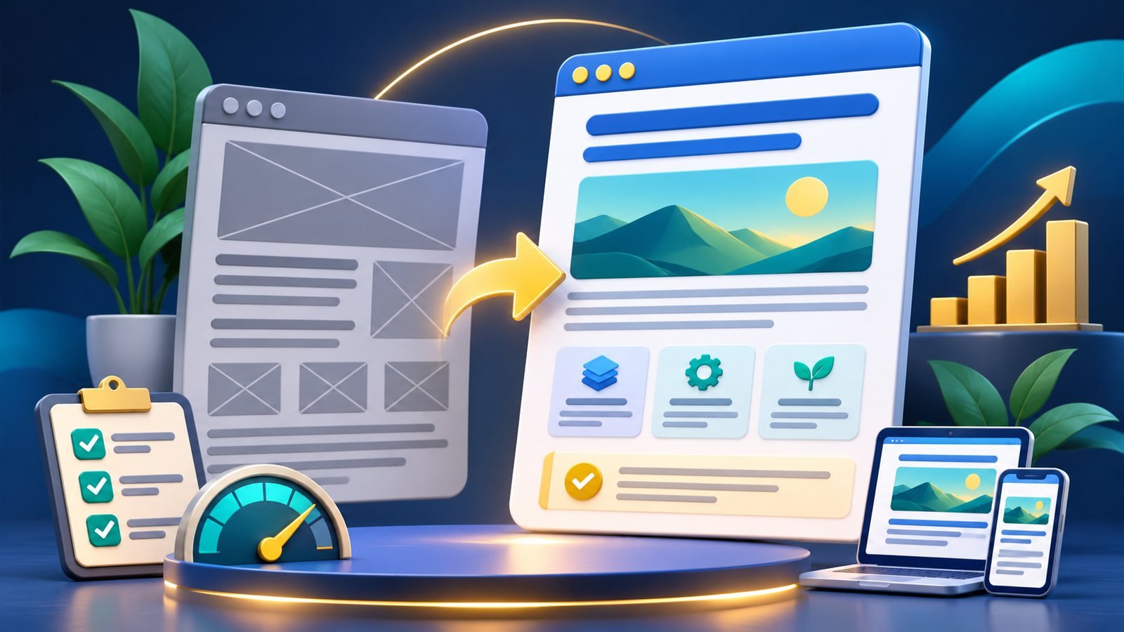
Your homepage is often the first page visitors use to understand what the site offers. In a few seconds, a new visitor should be able to identify the subject, see useful starting points, and find the main navigation. A logo and slogan alone may not explain the site; a large wall of cards may make it harder to choose.
Write a short, concrete introduction that explains who the site helps and what it provides. Place the most useful sections near the top, label links by destination, and make the menu predictable. If the site is a financial resource directory, for instance, “Compare equipment lenders” is clearer than “Explore more.” Avoid promising outcomes that the site cannot control, such as guaranteed approval or funding.
Check the homepage as a visitor: Does the main heading match the actual service? Do buttons lead to working pages? Is there a clear path to About, Contact, and privacy information? Are promotional elements separated from navigation? Does the page remain usable on a phone? Google’s AdSense readiness guidance highlights unique content and clear navigation; its rejection guidance lists potential navigation problems.
Example: A directory homepage with 14 identical “Learn more” buttons can be improved by grouping resources into named categories, adding one-sentence explanations, and using descriptive links such as “Read the truck parking guide.” This makes the user’s next step clear and gives the page useful context beyond the links.
Run SiteReadyScore to inspect public homepage signals and identify pages or links to verify. Use the result alongside a manual mobile walkthrough. The scan is a review aid; the homepage still needs a human editor who understands the site’s audience.
Homepage checklist: Purpose statement; clear section labels; descriptive links; working destinations; mobile menu; accessible contrast and tap targets; visible paths to key site information; no placeholder sections.